GLOBAL
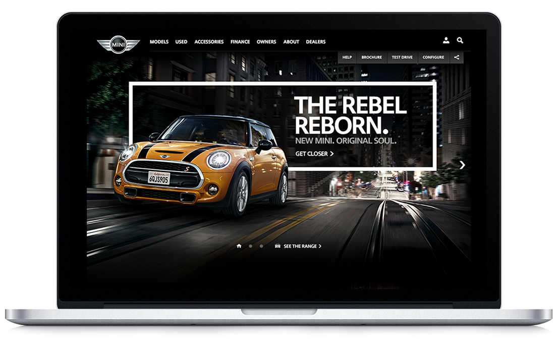
MINI WEBSITE
MINI
Responsive Platform
Redesign of the MINI global platform website, spanning some 130+ markets worldwide – our goal was to make the best automotive site in the world. An epic two year long project to rethink what a modern, responsive, automotive site should be. Working in small multi disciplinary teams of creative, developers, and UX. Tackling parts of the site in sprint cycles working hand in hand with the clients as the product owners and involving key stakeholders at every step of the way. Involving lots of visits to the global MINI HQ in Munich, Germany to work side by side and presenting to all facets of MINI.
With a project so huge it is difficult to try and condense two years of work into a small case study – I cannot show everything, there simply isn’t the time or space on this page. I have tried to show the most interesting parts of the site – from my perspective and offered some insight and thinking to illustrate how the project was shaped and crafted.
A real team effort – I was involved in all facets of the project, setting tone and direction across key sections of the site which drove the visual language and design direction for the rest of the site, working with tech to break boundaries and push them to solve our creative problems, and supporting our design team with direction, inspiration, and guidance. My roles involved visual design, art direction, creative concepting, developing animation & interaction prototypes, interface & interaction design, client presentations both on-site and remote, spear heading creative documentation, scoping, design consistency, oversight of documentation, oversight of 3rd party technical and creative agencies, guidance, oversight, and mentoring of other creatives and designers.
MINI is one of the few car brands that has a twinkle in it’s eye and a certain British playfulness and tone of voice that only MINI can get away with. At every step we made sure that the site had personality – not only in how it looks, but the little details – small interactions, transitions, and animations – not to mention the copy and storytelling.
ROLES
Art Direction
Lead Design
Animation & Prototyping
01.
IN THE
BEGINNING
It all began in 2012 when AKQA won a pitch to design the new global MINI responsive platform project. This was in the pioneering days of what we know now as responsive design. The project was designed for the future and was AKQA’s vision of how the modern consumer would be using and viewing websites in a couple of years time.
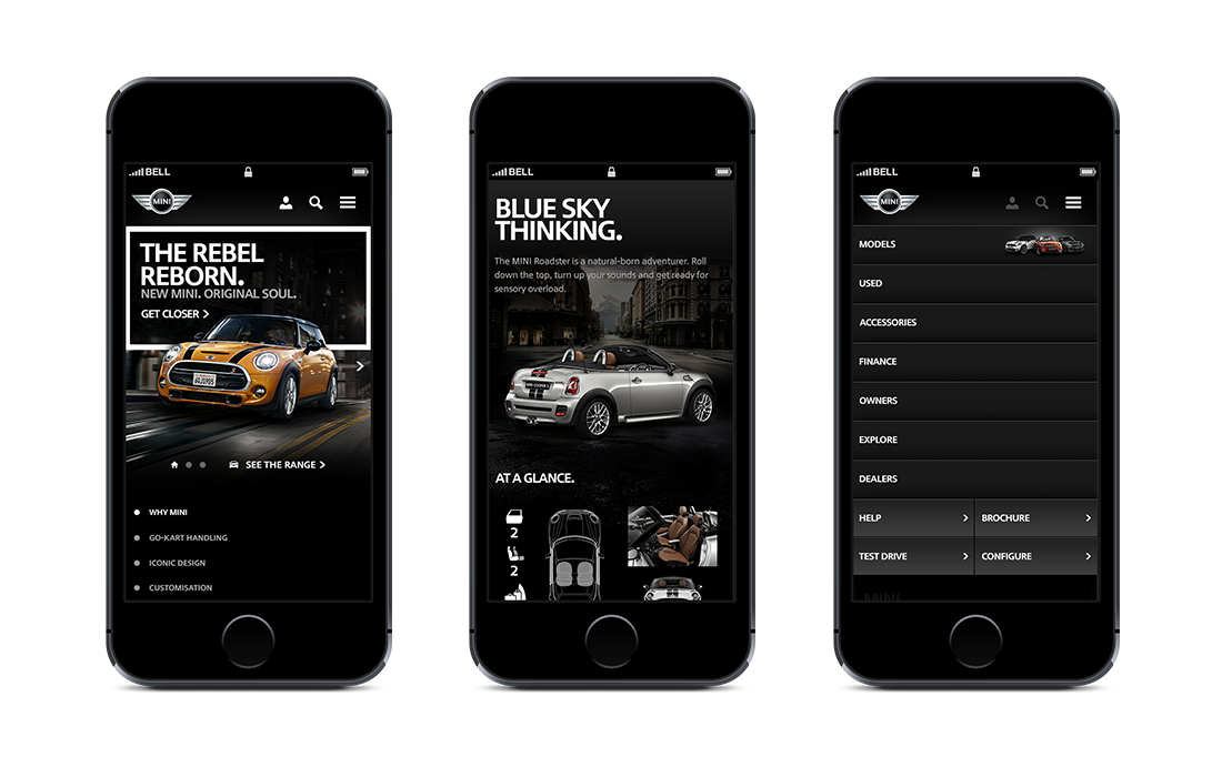
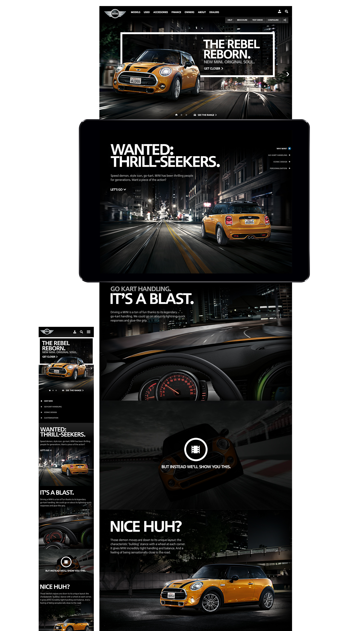
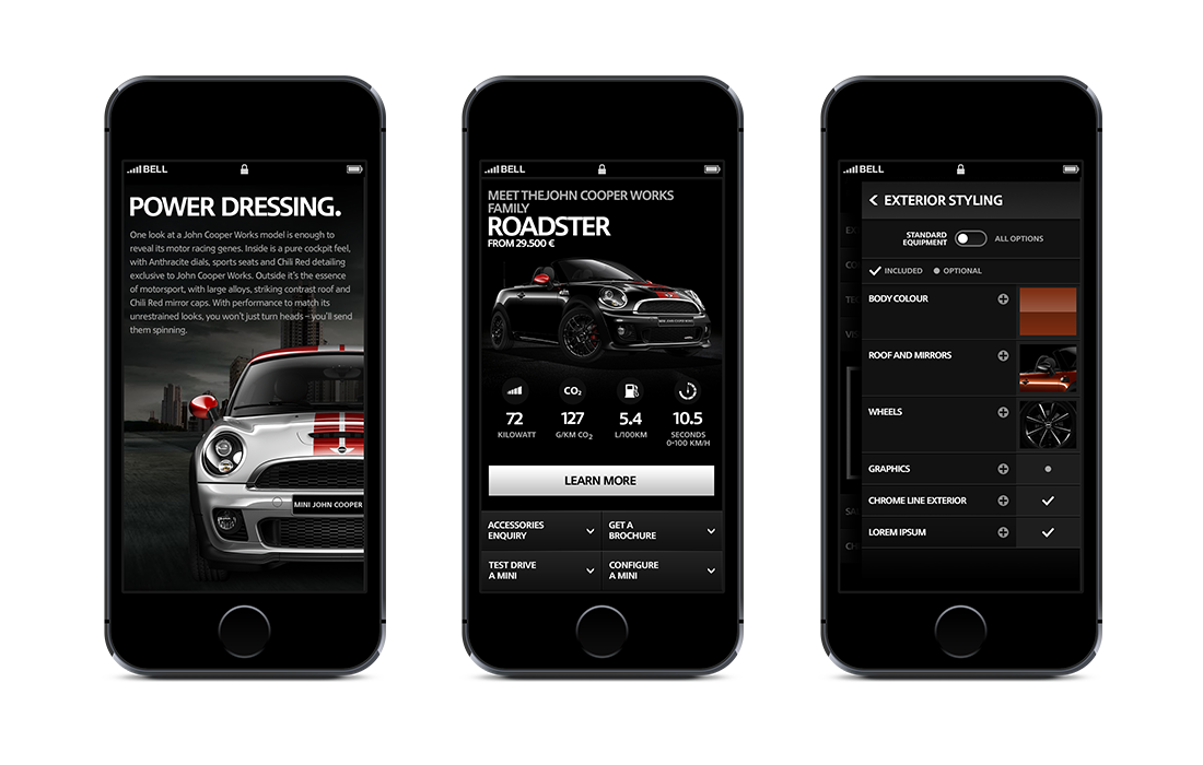
With this in mind the design philosophy for the project would be ‘touch first’, this meant that we designed primarily for touch devices – tablets and phones. This would mean that our designs would work and adapt easily for ‘point & click’ – laptops/desktops.
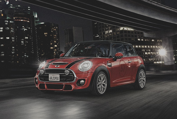
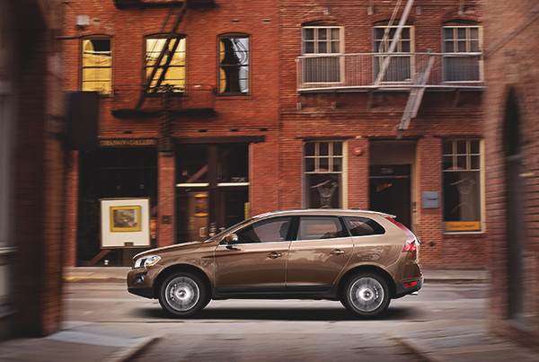
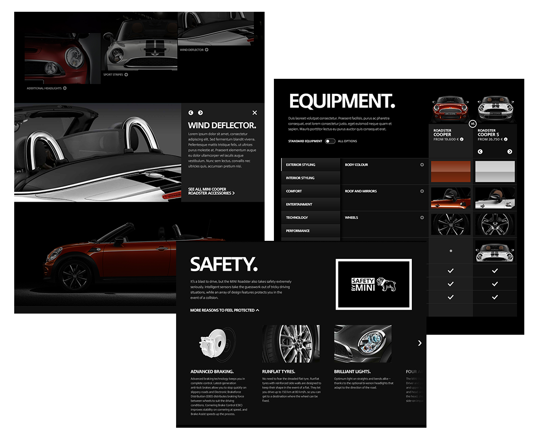
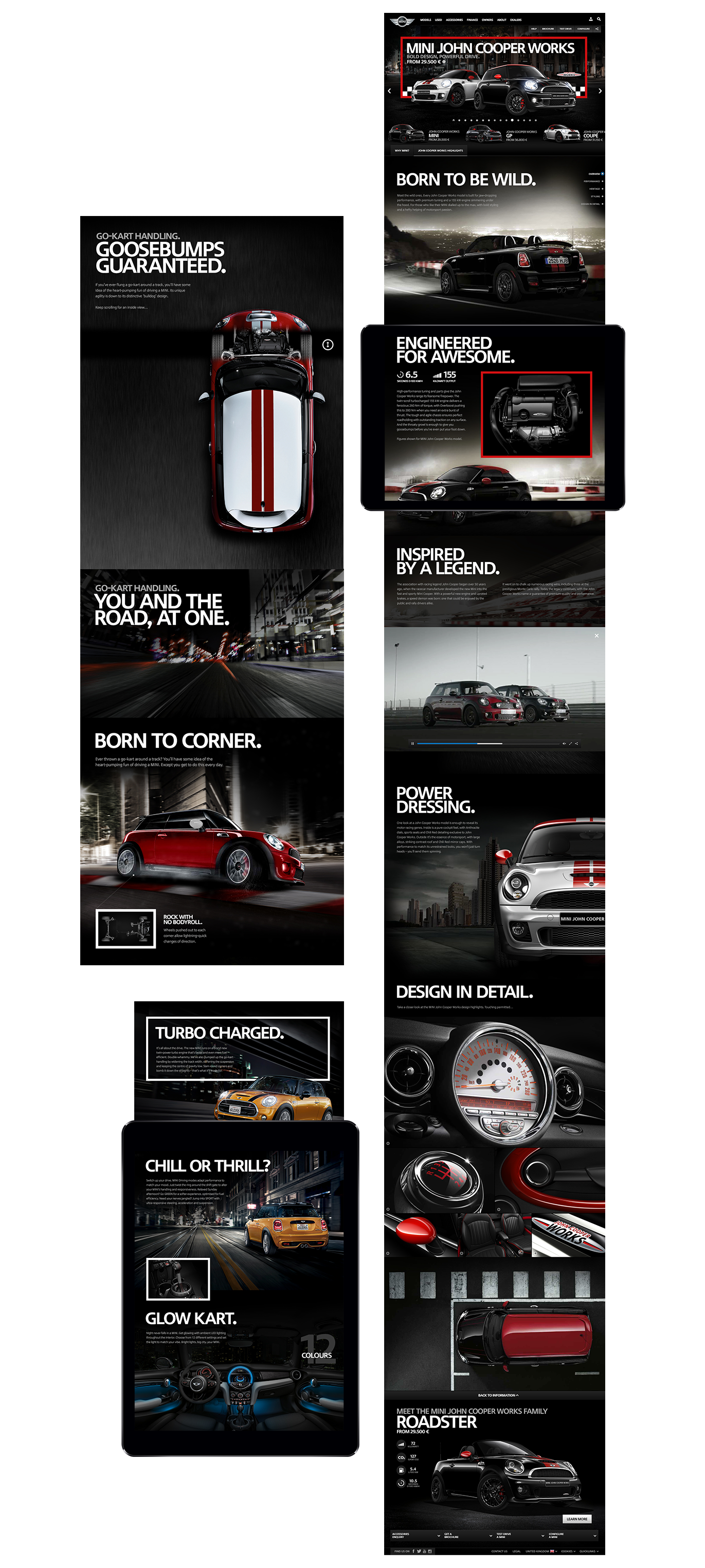
One of the most important aspects for MINI is the concept of ‘the car is the star’. The car itself was always to be centre stage, like a rock star the site should revolve around the personality and looks of not only the cars on offer, but in fact MINI – the brand itself.
We planned to tackle this project quite differently from many agency style projects – at the time at AKQA we mainly worked in the traditional ‘waterfall’ approach. Adopting a form of Agile working, we formed small teams of creative, technology, and user experience to tackle key areas of the site in short quick turnaround cycles know as ‘sprints’ – constantly improving as we went. The idea being the client themselves would be the ‘product owner’ and would be constant contact with the team designing the solution. This offered the client a fantastic opportunity to truly own the project and work side by side with the ‘concept’ team.
Given this approach we were to travel to the MINI global HQ in Munich, Germany as often as possible to work with our clients and to present face to face our latest work and thoughts. The philosophy here was to present in any way we saw fit to describe our vision – whether this be simple sketches, animation prototypes, photoshop files, or wireframes.
RESEARCH
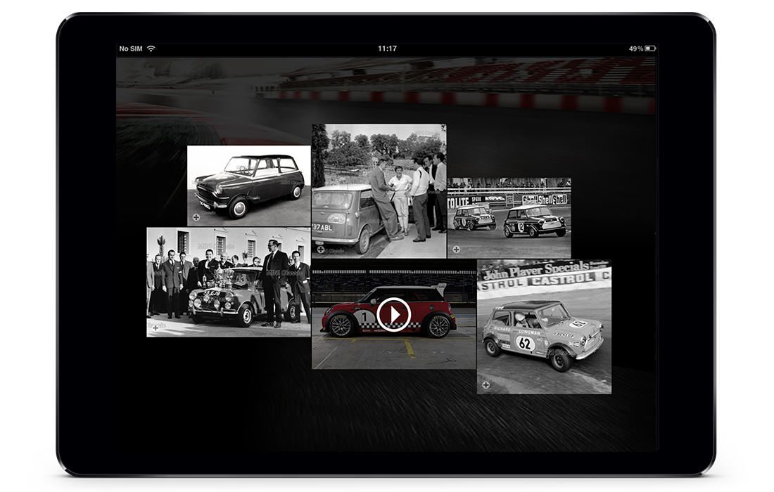
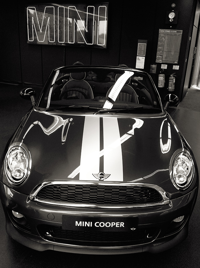
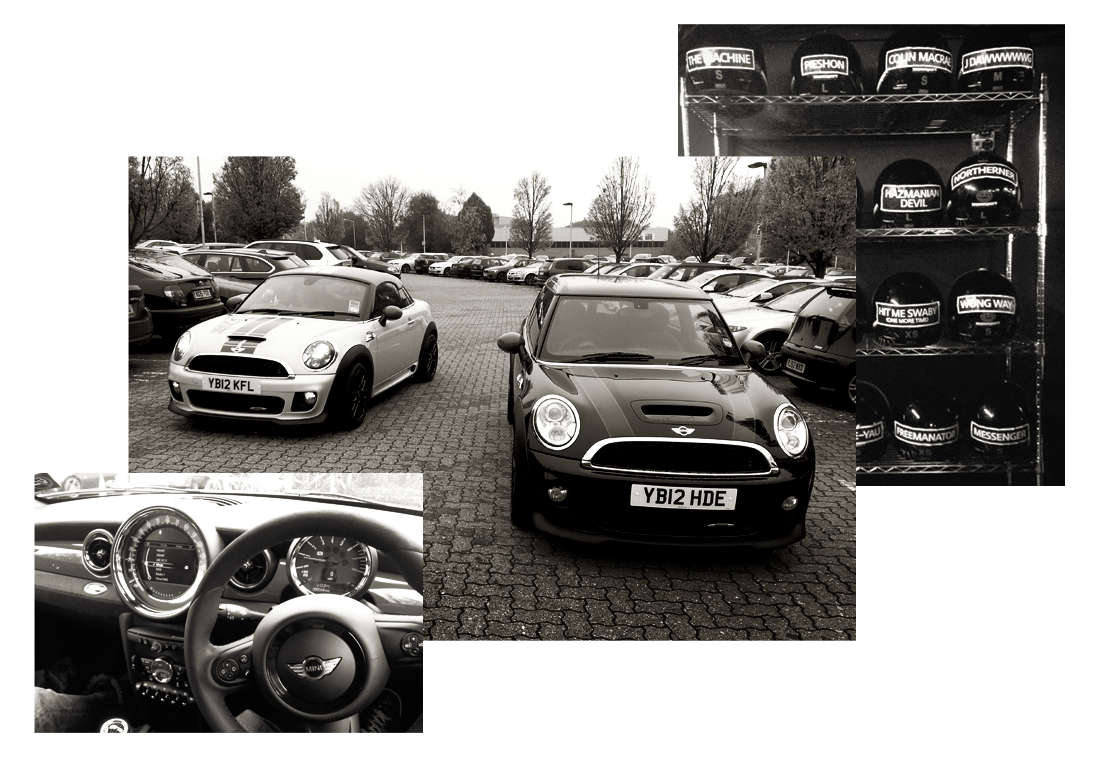
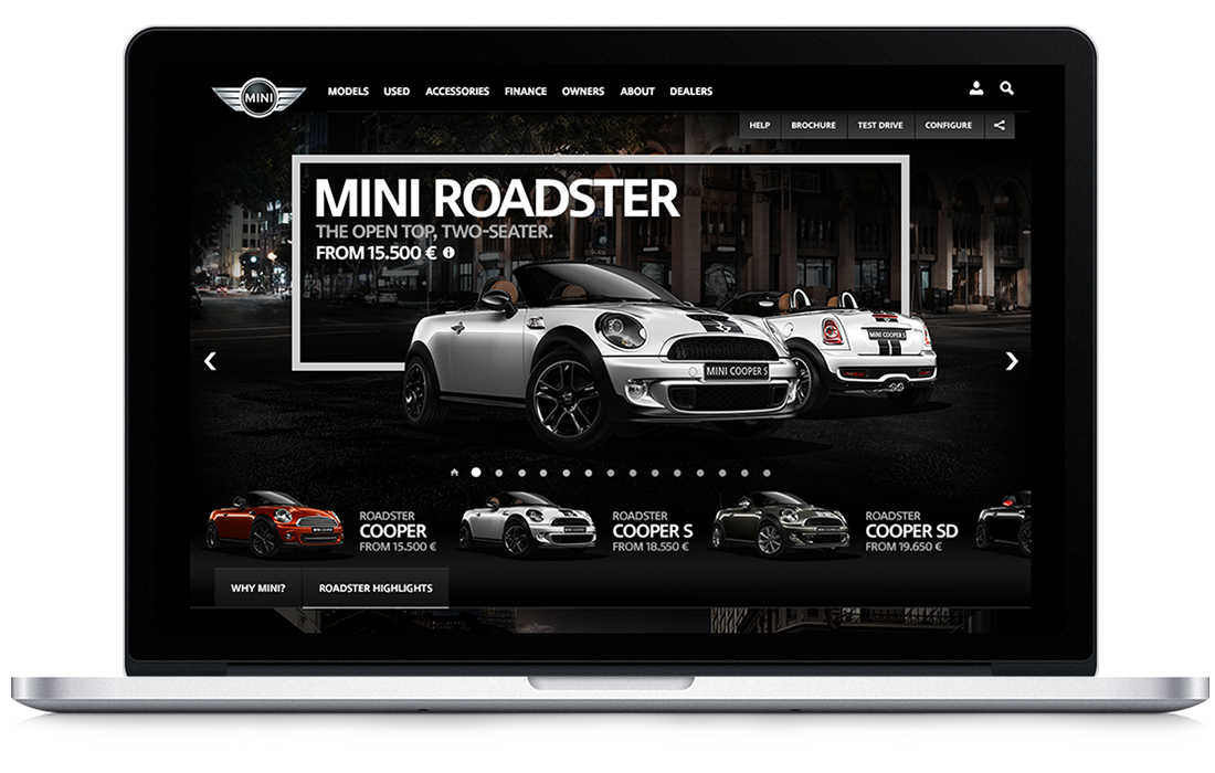
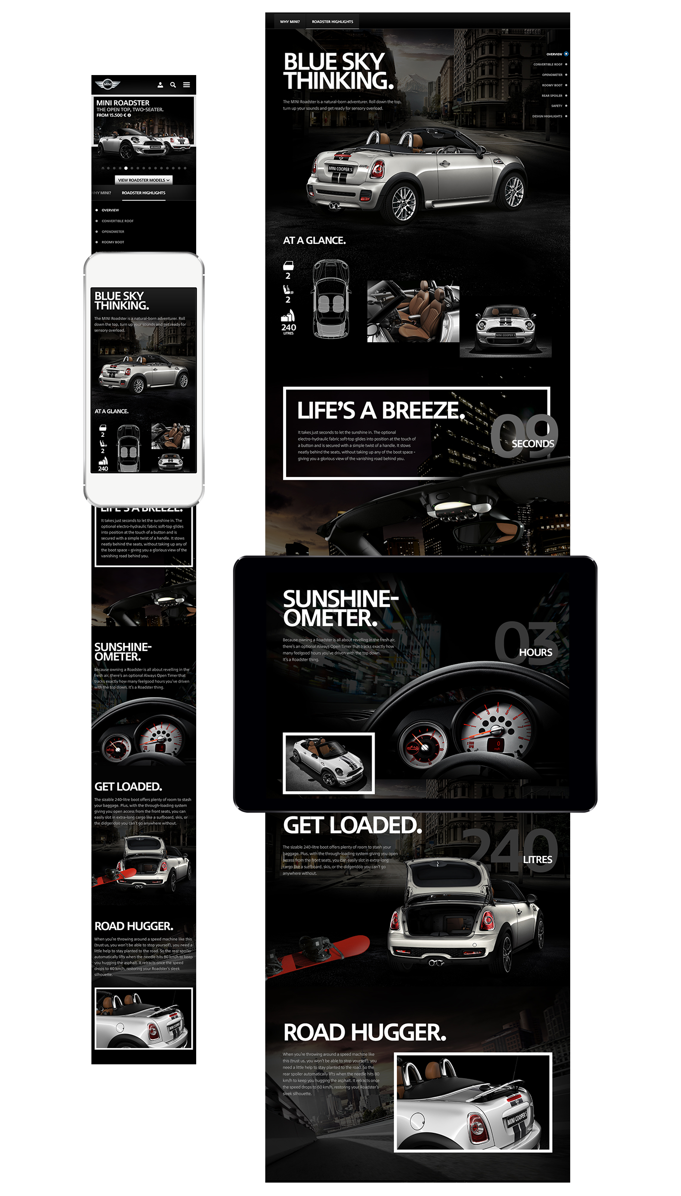
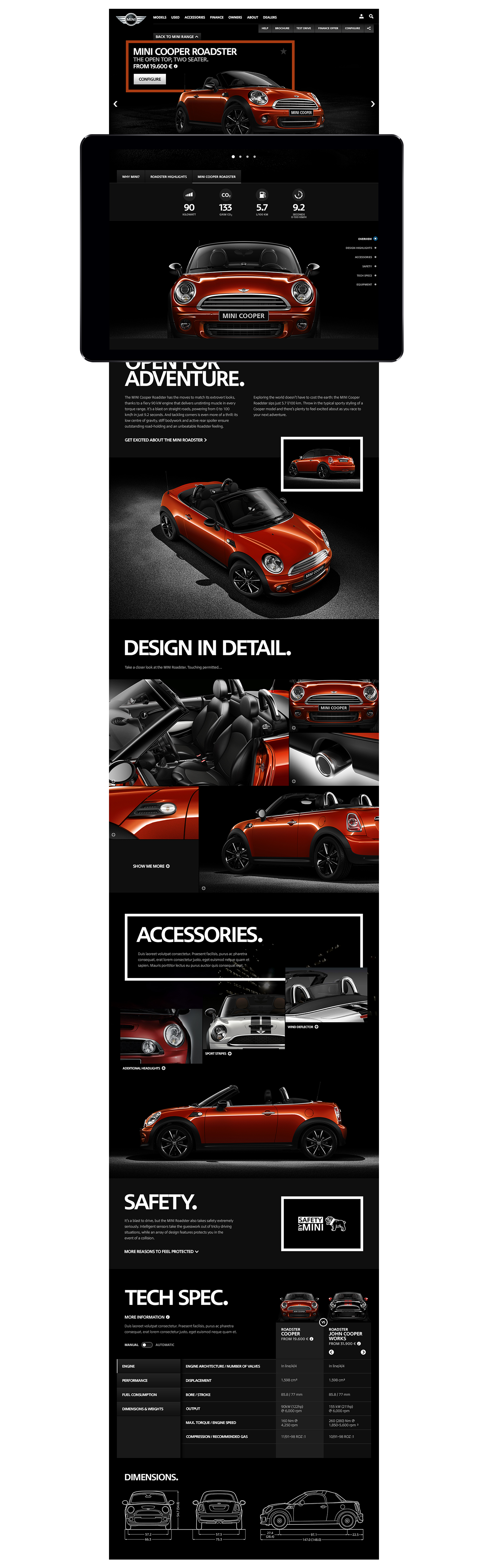
MINI has some 10 different types of MINI, surprised? We were too. Each type of MINI is quite different – from the sporty two seat Roadster, the large 4×4 Countryman, to the classic Hatch. MINI told us that people have a hard time understanding the differences between the models, and what each has to offer – so it was important for us to understand the range and why someone might go for the standard ‘One’ or the ‘Cooper S’. There was a lot to learn so we went on driving days, dealer visits, read through the brochures, and even went go-karting to understand one of the key principles of the MINI – go-kart handling.
We also set out to know what makes a great car site, and extensive research into not only competitor sites, but the best responsive sites we could find. We created all kinds of prototypes and proof of concepts of responsive design, to prove to MINI and BMW that it was the future and it would work for them.
02.
THE
DESIGN
Our approach was to first align with MINI about what they wanted to create. Using ‘Confluence’ a form of wiki, we wrote documents, gave inspiring examples of design, sites we liked and talked about our guiding principles. Those guiding principles defined what direction the site was going to follow and from a top level were:
– Car is the star = Make the cars always centre stage and always looking beautiful, lots of large full bleed imagery, story telling, and good looking layouts, the site should be as stunning as the cars.
– Playfulness as standard = the interface is the brand, MINI is full of personality, when users interact with the site it should feel unique, playful, and unexpected. Of course all as and when appropriate.
– The sales funnel = the core pages have a purpose to inform user about the cars and get them to arrange test drives, order brochures and so. Forms, search, DLOs, should be a state of the page – and should not direct people away from what they were viewing.
– Shallow site architecture = logical structure, information and pages not buried under layers of hierarchy.
Design is a form of problem solving, so an understanding of the challenges was key to designing a solution that worked for not only the user but also the business.
Our main challenges:
– 130+ Markets = lots of languages & varying market requirements.
– Responsive design = design must work across a host of devices, from ageing Android phones to the latest tablet, but also should not compromise desktop users by over simplifying.
– Design for a modular CMS = each page is built up and comprised of responsive ‘modules’ which can be mixed and matched to create page layouts.
– Lots of stakeholders = MINI is a large organisation owned by BMW group, with many departments & sub departments all with differing opinions, thoughts, and goals.
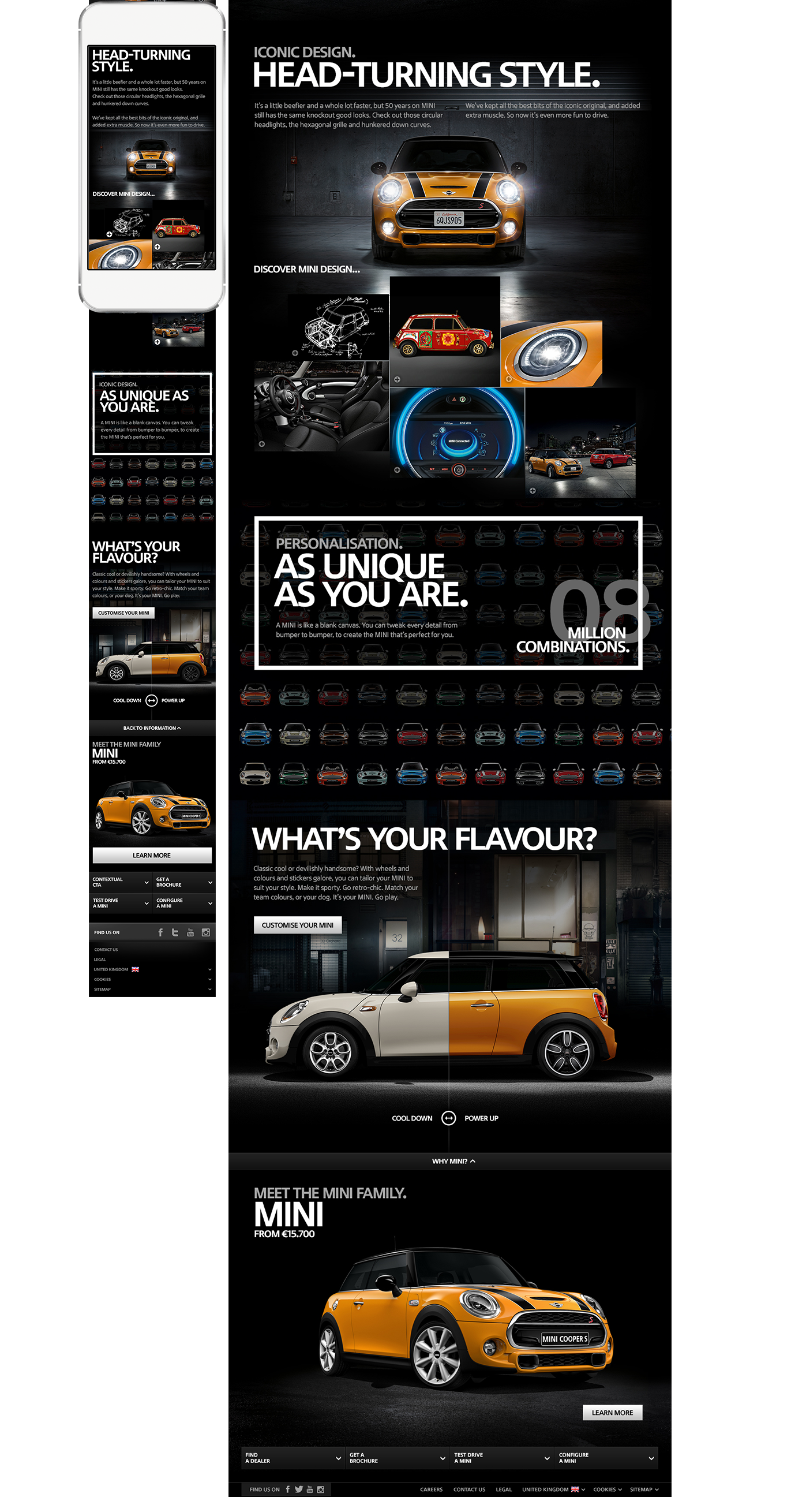
EDUCATE & INSPIRE
Show people the cars, pull out the key features that truly make it a MINI. The MINI Roadster has an openometer – a dial that adds up how many hours you’ve had the roof down – this is a feature that only MINI could create – so let’s talk about it. We pulled out the characteristics of each car and talked about them in a human way, that would have meaning to the audience, rather than simply listing all the technological advances and data.
The range is confusing, each type of MINI is available in an assortment of trim options and engines, ‘Cooper S’ is sporty ‘One D’ is an economical diesel. Most people think there are only a couple of types of MINI, when designing the site there were 10 different chassis, and some 110+ types of model! The site was designed to allow people to easily explore the whole range, and discover the different types in a more exploratory way, which is easy to understand. This helps educate buyers about the cars gradually.
PLAYFUL INTERACTIVITY
The site is sprinkled with playfulness, surprise and delight – so the site itself feels like the brand. Encouraging interactivity and also adhering to our principles of bringing information to the user, not diverting them off the page to image galleries, stats, and accessories catalogues. Small single purpose quick prototypes were created to illustrate to the client the kind of interactivity we liked.
03.
DIRECTION &
DOCUMENTING
With a project this large and with three separate workstreams it was important to manage consistency between layouts – at one stage we had 8 creatives working on the project. Between my creative director and myself we arranged and ran a weekly ‘design consistency’ workshop were we looked at the latest designs and made sure that visual design and interactions were consistent with each other. Creating GUIs to standardise interface elements as well as font styles to make sure the design language was consistent.
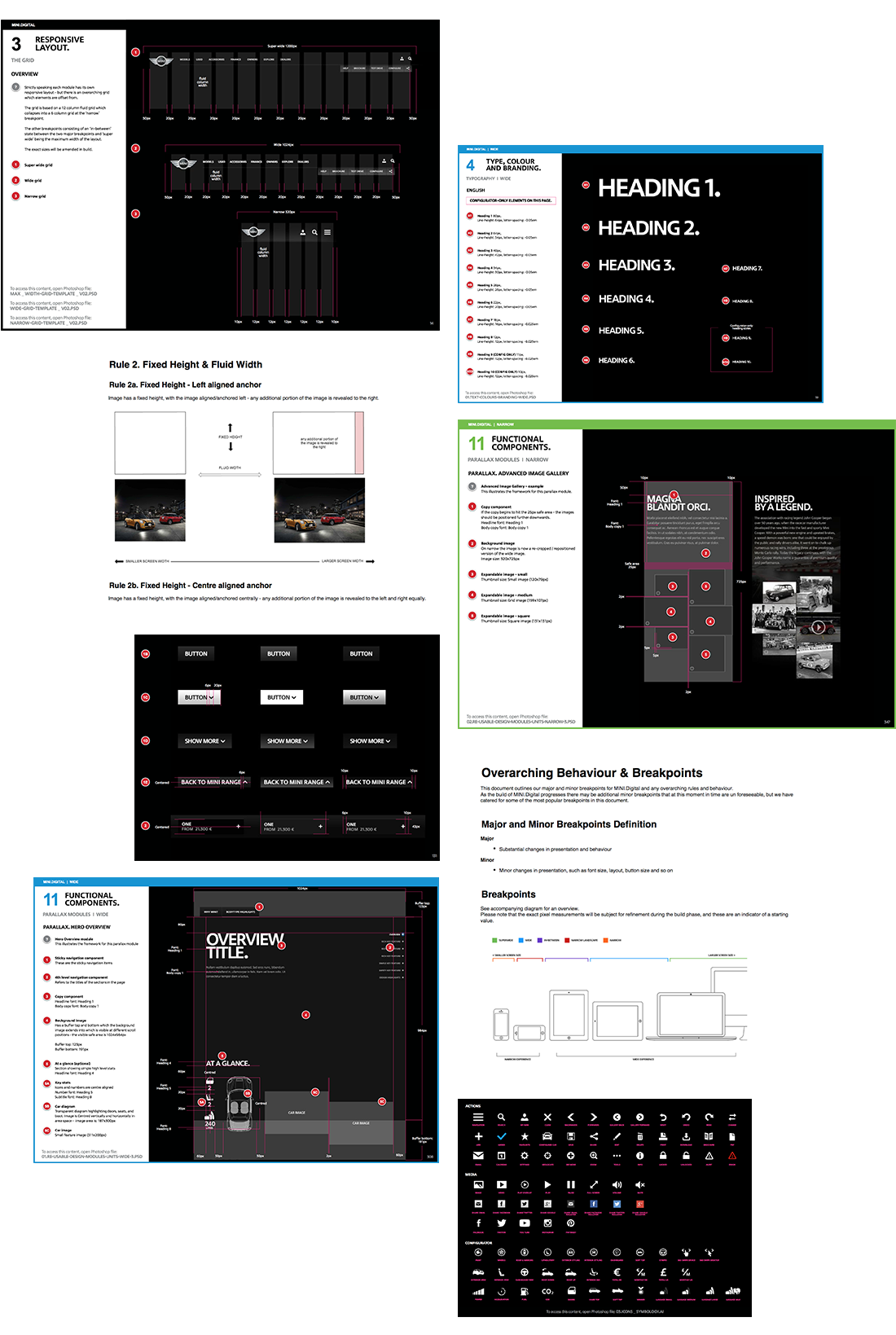
Documenting such a site was complex, as at the time of designing we were not sure who exactly was to be the build partner. It shifted from AKQA, to BMW IT, to a range of suppliers. As BMW IT and other build firms were based in Germany, we needed to make sure the documentation of the project was rock solid and easy to understand. We had an assortment of deliverables and documents, from the rough motion studies of interactions, to PSD layouts, to a vast range of deconstructed responsive modules.
For various reasons too numerous to go into, we created a large styleguide for build partners, CMS editors, designers from other agencies, and our clients. This utilised the GUIs, which had turned into a whole range of templated and pixel-perfect responsive modules, buttons, fonts, and image sizes. Together with a designer we created what turned out to be a 600 page behemoth of a styleguide, detailing responsive grids, design principles, everything a developer would need to create our project. This was supported by technical documentation on ‘Confluence’ and numerous prototypes, animations, and motion studies.